As a project in a typography course, I created a book chronicling the English translation of famous arguments of two prominent Dutch graphic designers from a debate in 1972 that revolved around the competition between subjectivism and objectivism. The project’s only requirements were that it be a book and that the entirety of the transcript be included, and I found myself gravitating towards finding ways to express the duality and contrast between both designers’ arguments while highlighting the visual similarities between their work.
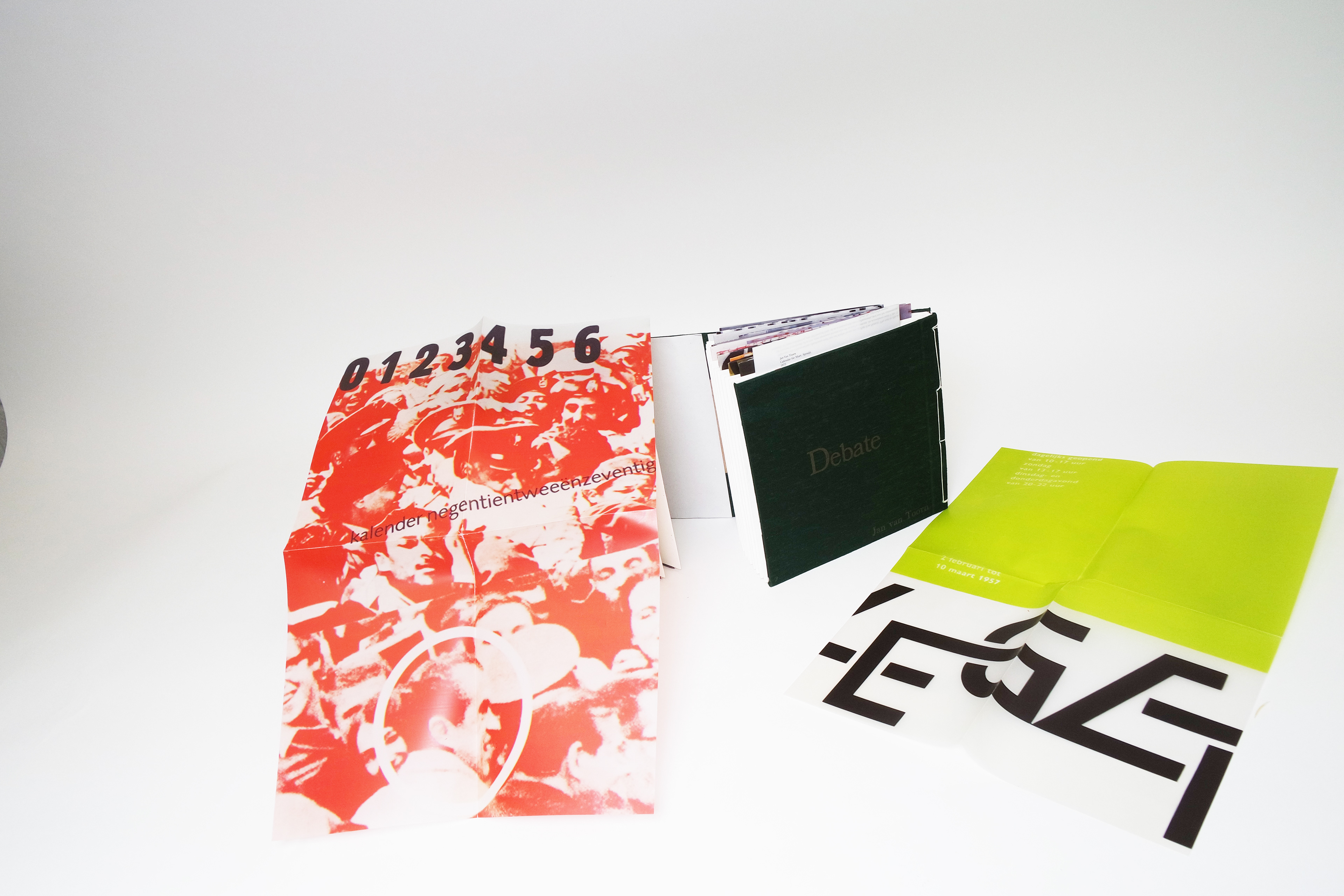
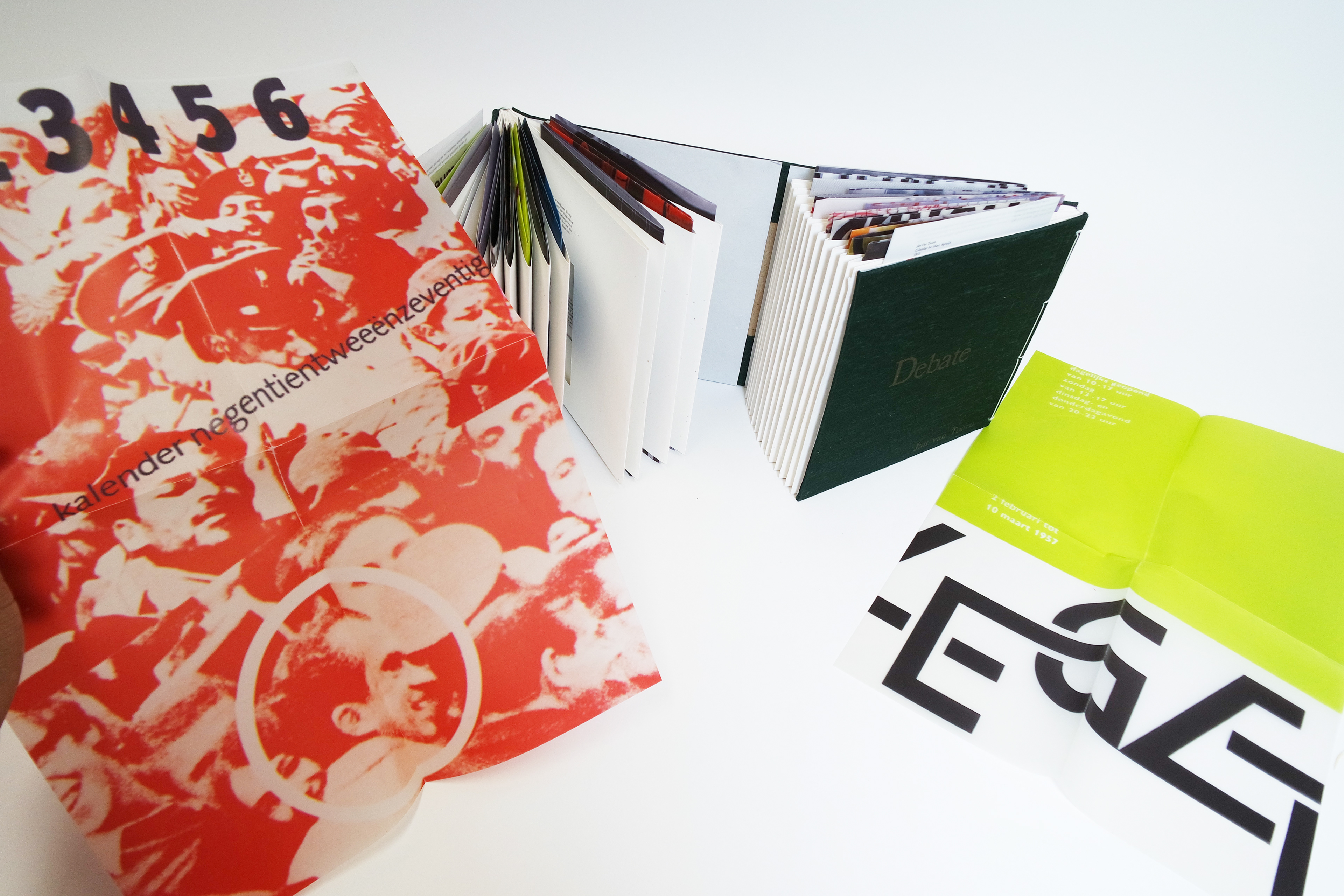
The Debate is a handmade book based on a well-known debate between Dutch graphic designers Jan Van Toorn and the late Wim Crouwel. With the only requirement for the assignment being to include every piece of text from the transcript of the conversation, I created a book that was less focused on text and more on the idea of duality, as well as using the work of the designers to help visualize the results of the theories and practices each creator argued for during the debate.
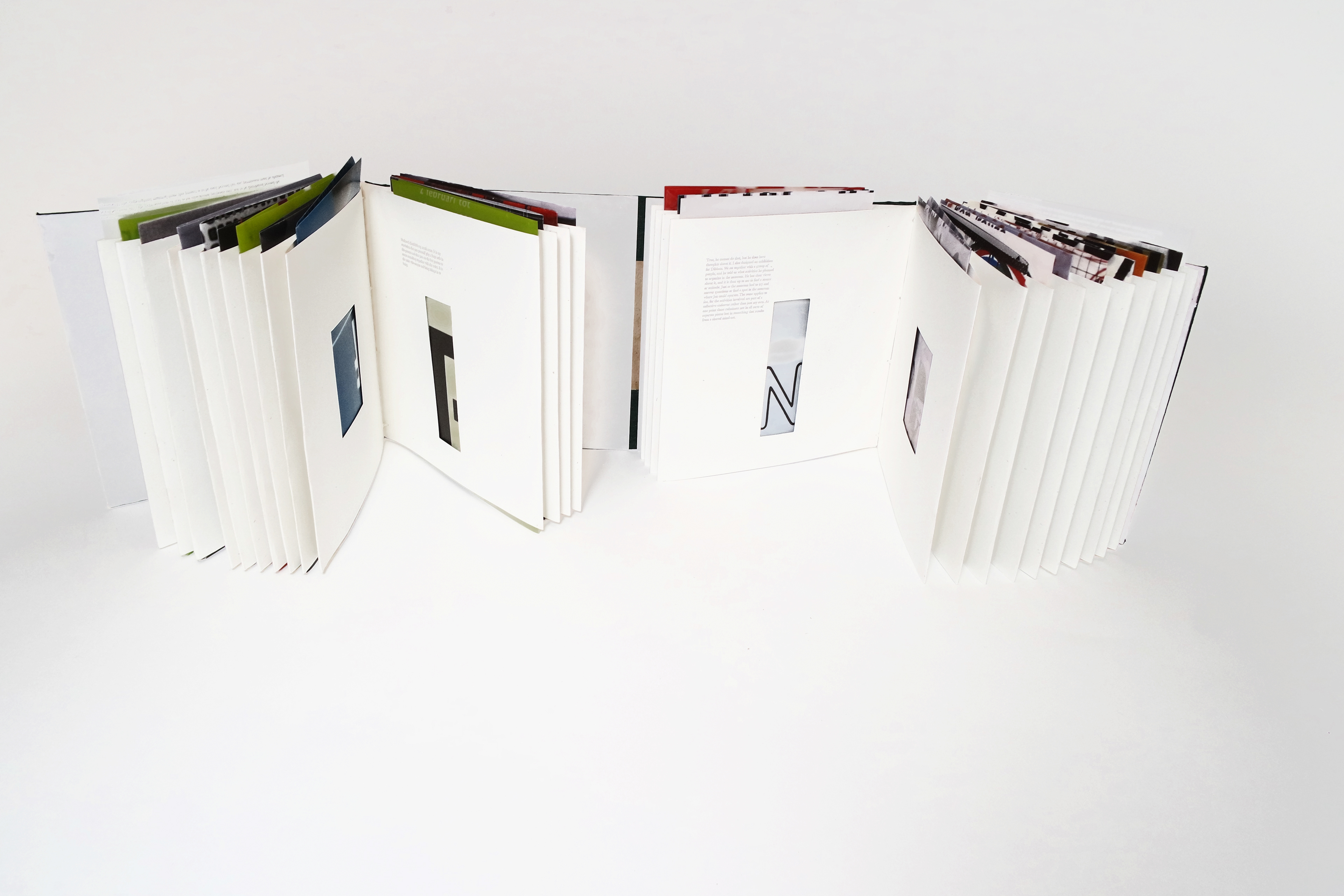
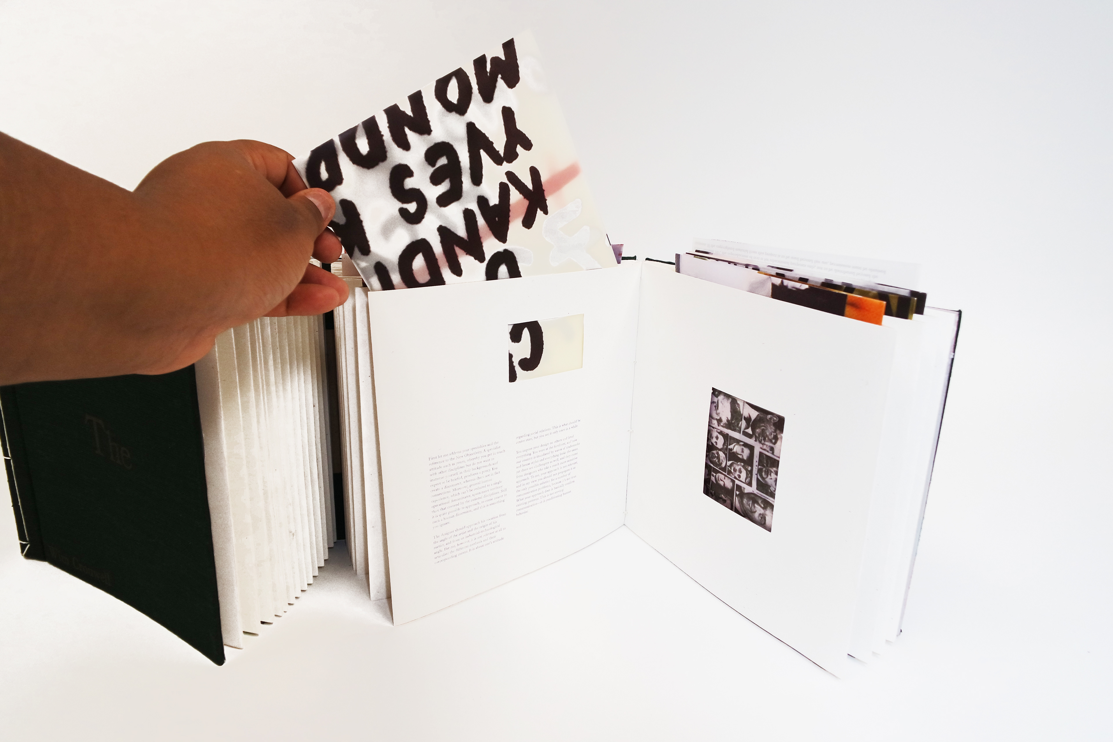
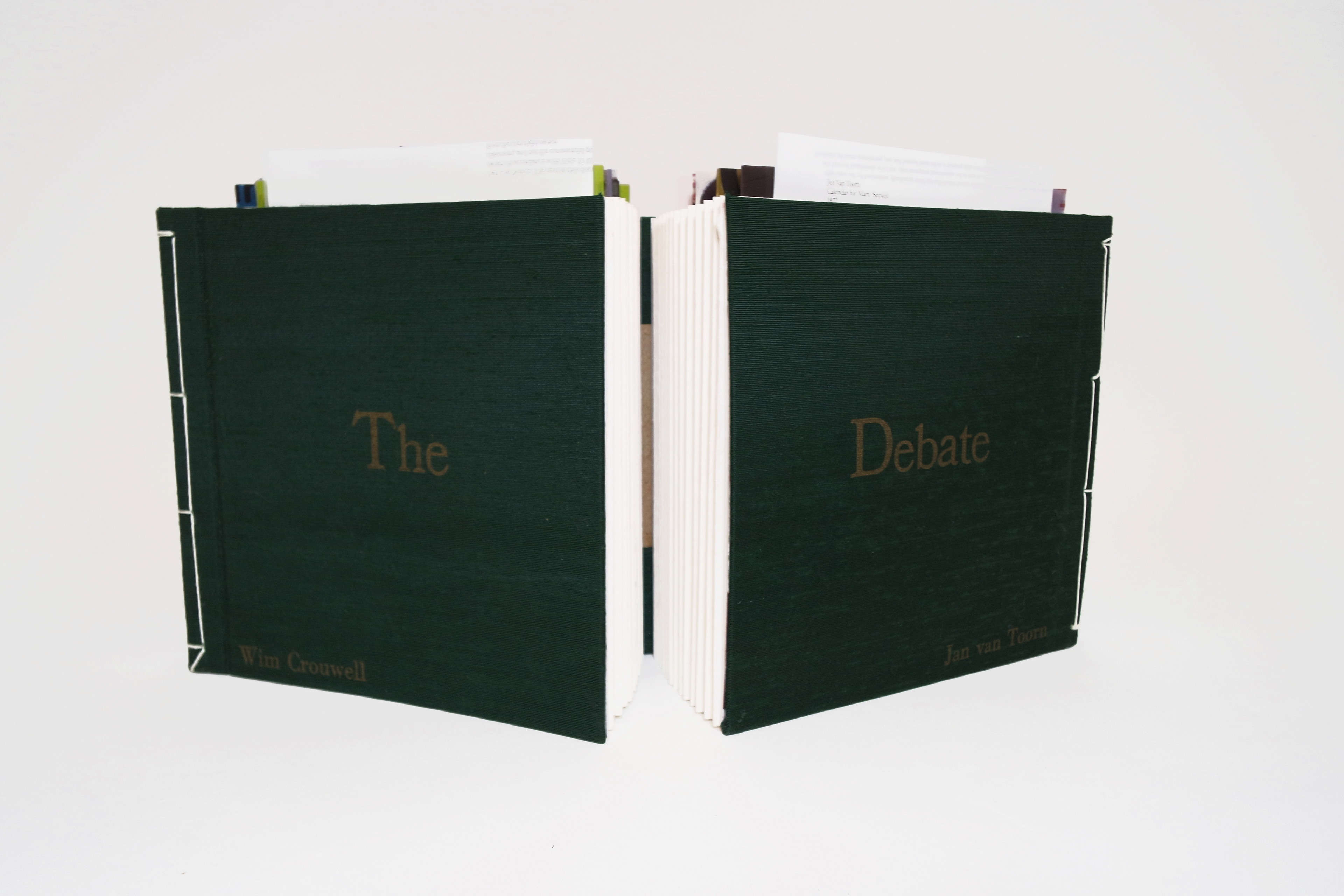
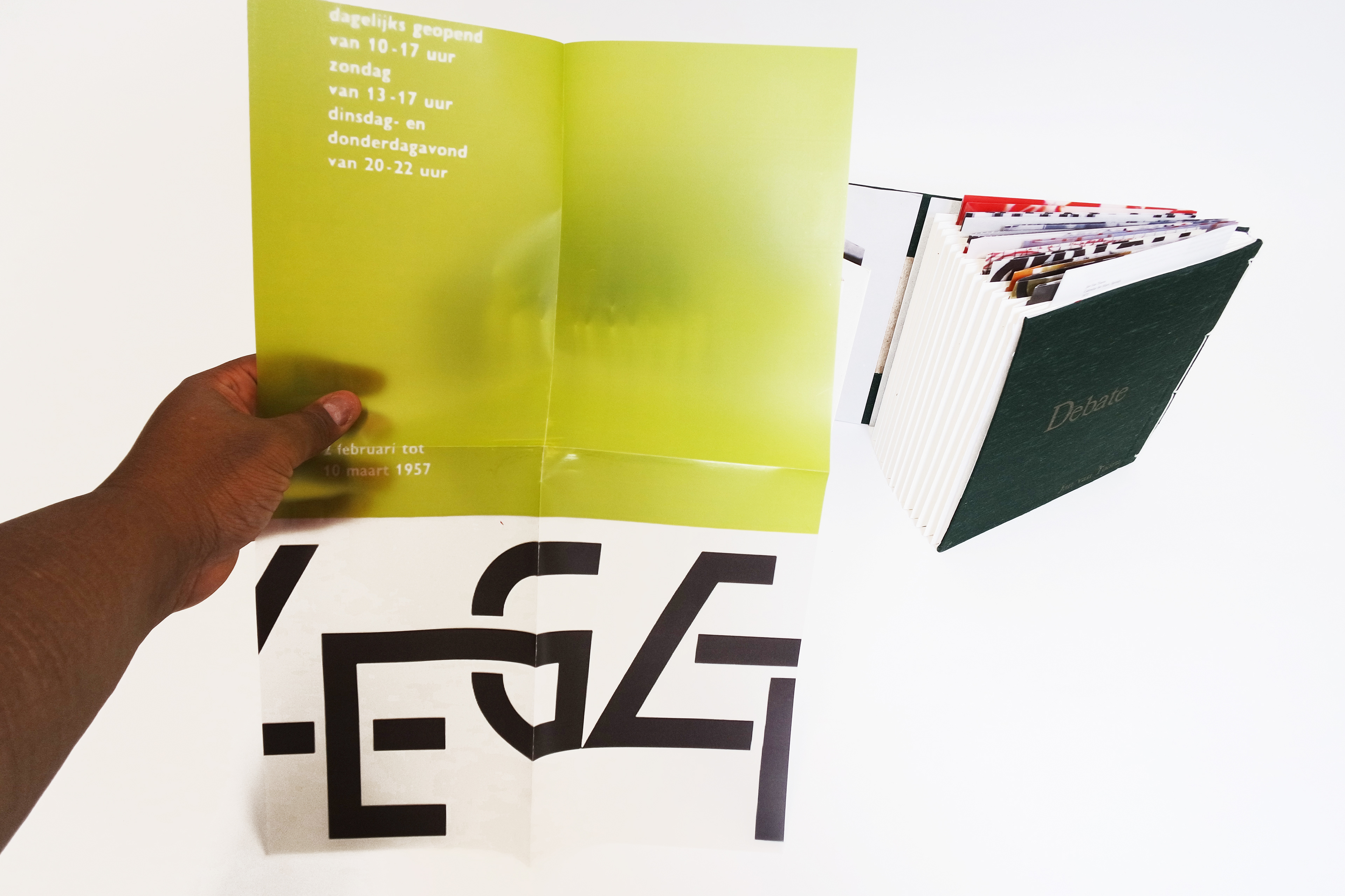
To physically represent the theme of duality I was experiencing throughout their argument, I decided to make a double-bound book with statements from Wim Crouwel and Jan Van Toorn separated on either side. Each statement corresponds to the one facing it. Instead of printing images of work directly on the pages, I made the choice to make the book with french fold pages that allowed 11x17 cropped samples to be folded and place inside and be seen peeking out of the top and in small cutout windows that mirrored each other, building further on the idea of duality, adding dimension to the book (quite literally), and giving a touch of color to each page's composition. I intentionally chose a humanist Dutch typeface for the body copy because of both designer's backgrounds, and bound the book in a hardcover to make it feel more sturdy and give it a sense that it had longevity, while the book being more focused on human interaction with materials and structure than the exact content of the body text helps it to feel more contemporary.
Because this debate was such an iconic moment in the history of graphic design, I wanted the book to feel like it had a place both now and in that moment. My hope was to engage the reader and inspire them to interact with a familiar form in an unfamiliar or new and engaging way.
I’d like to recreate this book at a larger scale in the future, as a size that allows for uncropped, full versions of all of the posters to be included inside the French folds. I would also take more care to die cut or laser cut the windows on the French fold pages to have more perfect rectangles than those I was capable of making by hand.