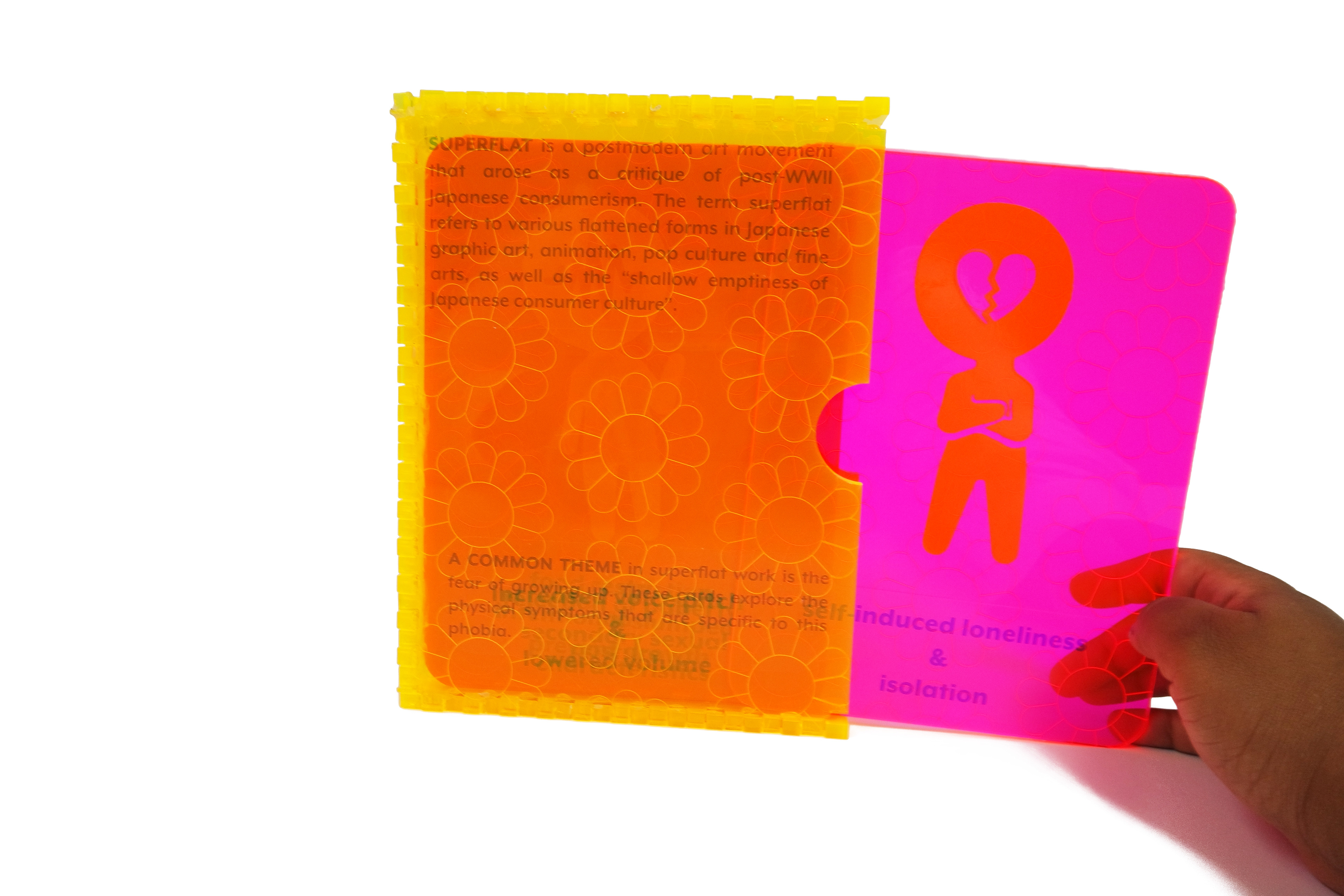
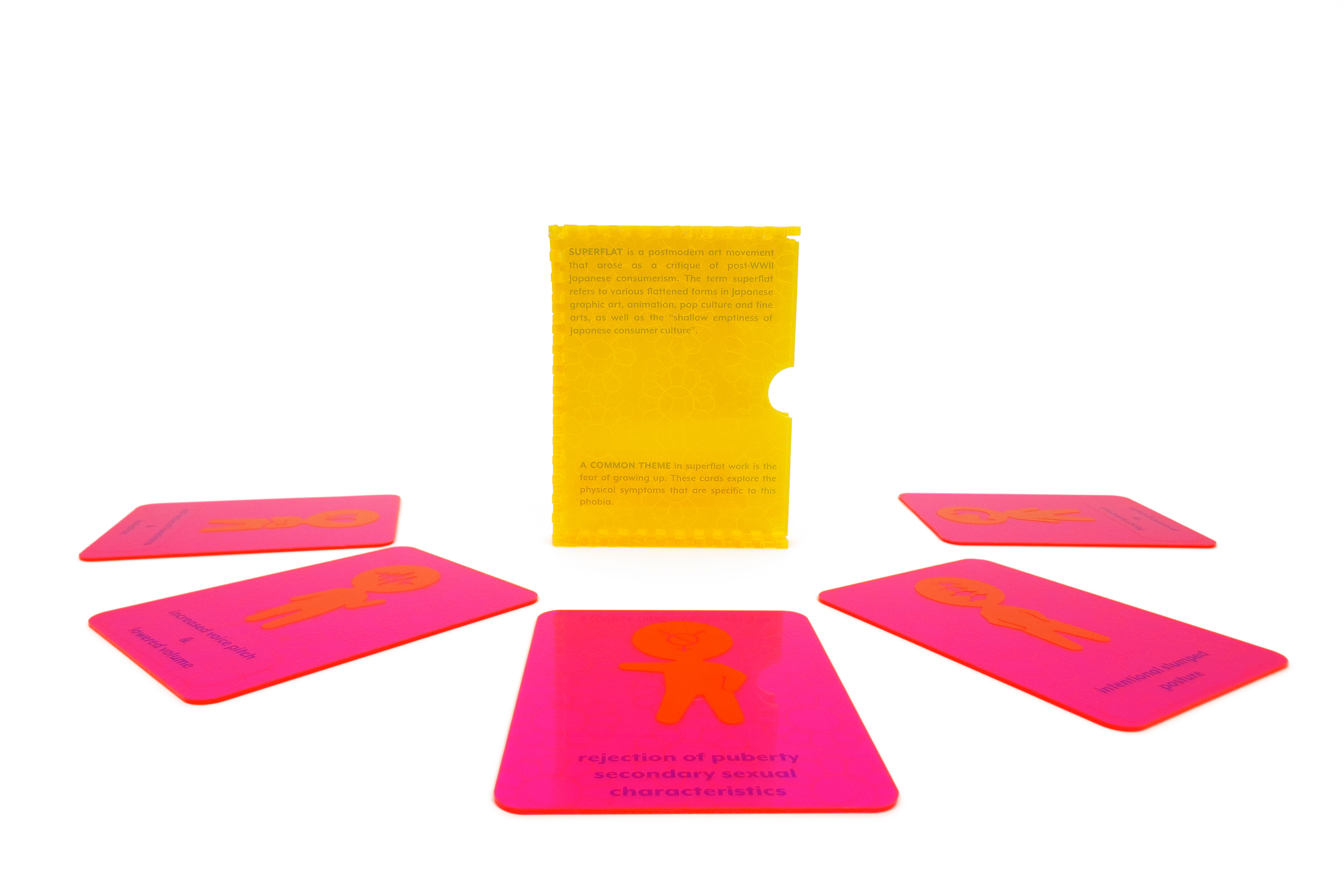
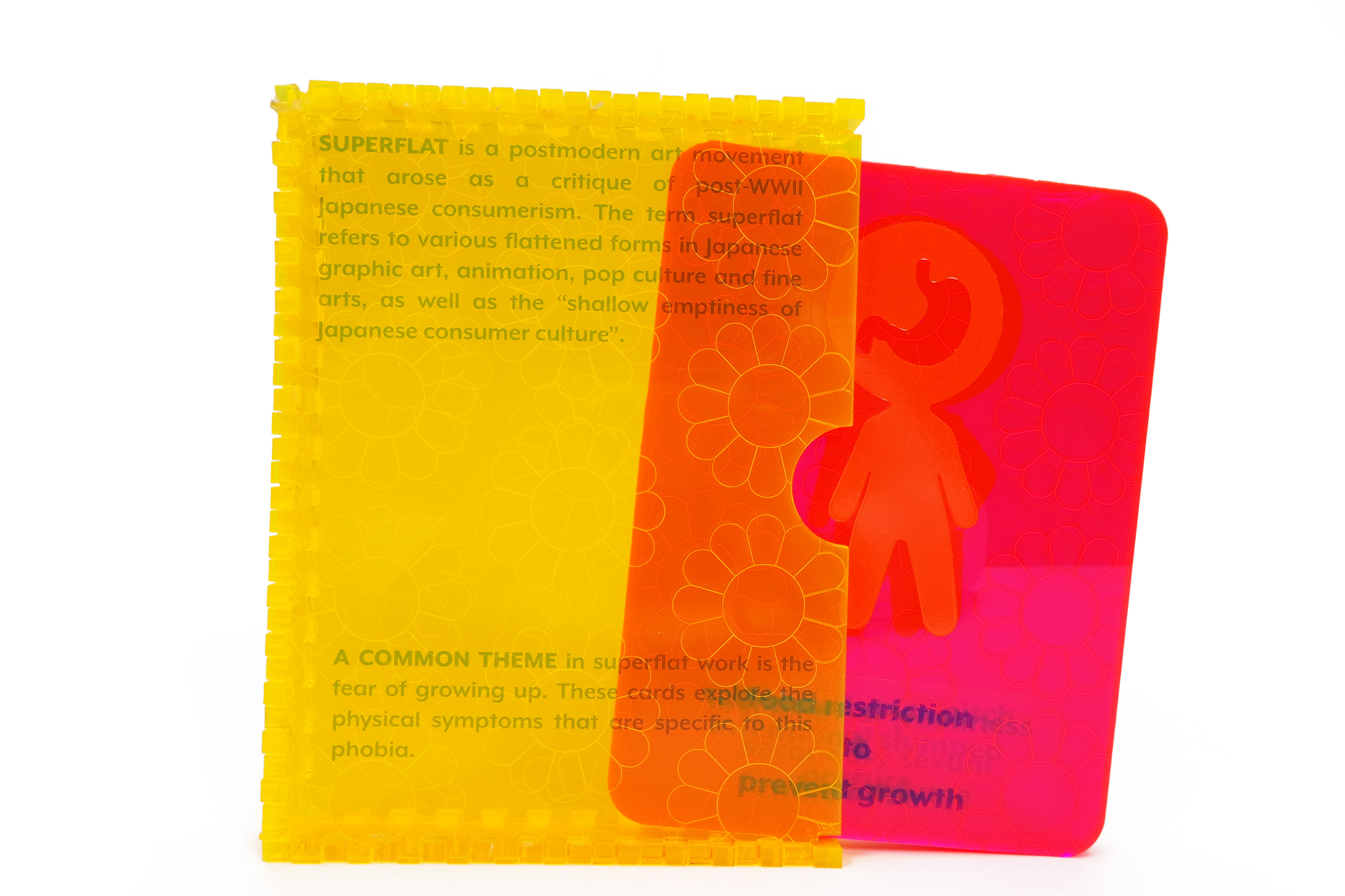
This goal of this project was to choose an art or philosophical movement and design a set of five educational cards and a box to contain them within certain size constraints that describe or define the movement using symbols and text. As a designer who appreciates Japanese popular culture and graphic design, I chose to focus on the Superflat art movement. Superflat is a postmodern movement whose initial purpose was as a critique of the rise of consumerism that had developed in Japan after World War II.
Superflat art is heavily influenced by manga and anime and draws from a variety of Japanese creations in popular art, the fine arts, and graphic art and design. Because its founder, Takashi Murakami, has chosen to define the movement very broadly, there is a huge variety in the subject matter of work between various artists and it has spread far beyond Japan. Since the symbols in the project had to goal to both represent and simplify the movement, I chose to use them to explore and expand upon a frequently occurring theme in Superflat art: the fear of growing up.
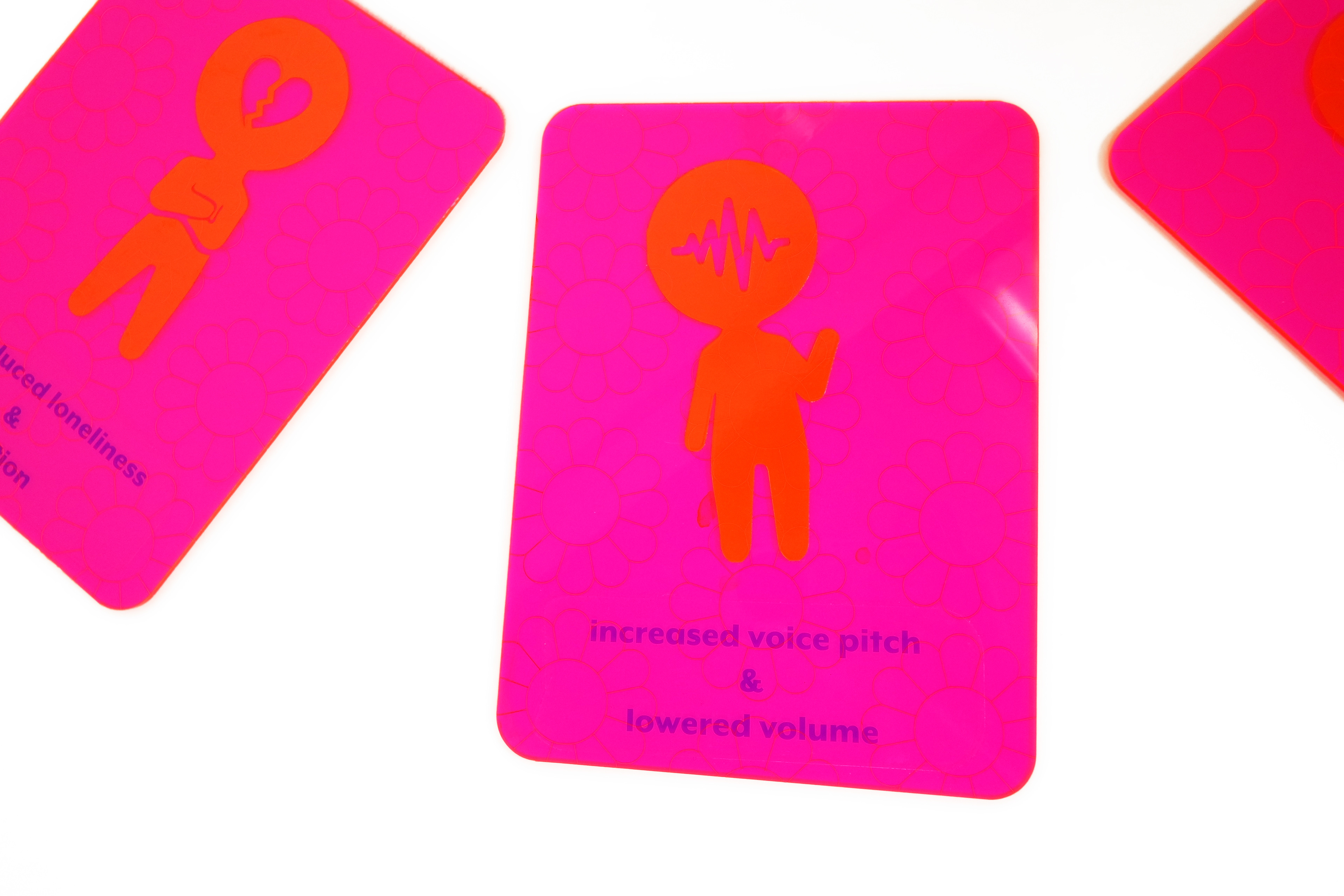
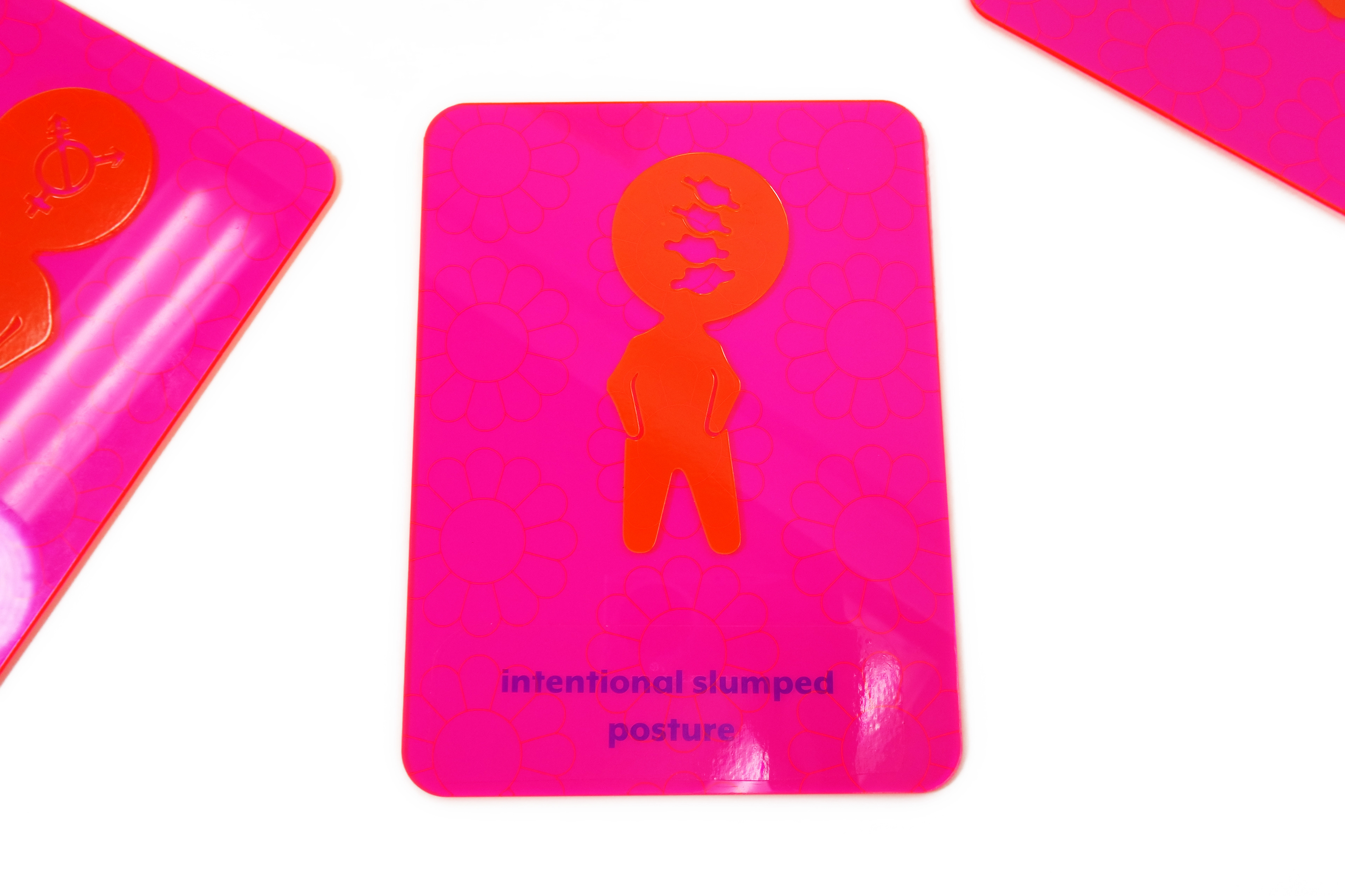
After feedback and direction from my professor and peers, I honed in on the fear itself, gerascophobia, and wanted to visually represent the manifestation of this fear in an individual that arises as a result of materialistic consumerism in Japan and other countries. I adopted elements of the Superflat style, like bright color palettes and the use of pattern and repetition. I chose to create symbols that might represent how the phobia manifests physically in an individual. Each card represents a different symptom of the phobia, and I intentionally used childlike proportions and rounded edges to highlight the idea of a young person being afraid to get older, as well as a primary color scheme to reference youth and childhood.
Because I have a strong interest in making objects more engaging and not just visual, but also interactive, I decided to make my cards from thin pieces of translucent colored acrylic plastic, whose qualities I thought were helpful in referencing the materialism and consumerism that Superflat art was initially born to critique. The shine and smoothness of the acrylic combined with heavily saturated colors invites a person looking at the cards to touch each one and examine them more closely, creating interest in the objects through their commodification.