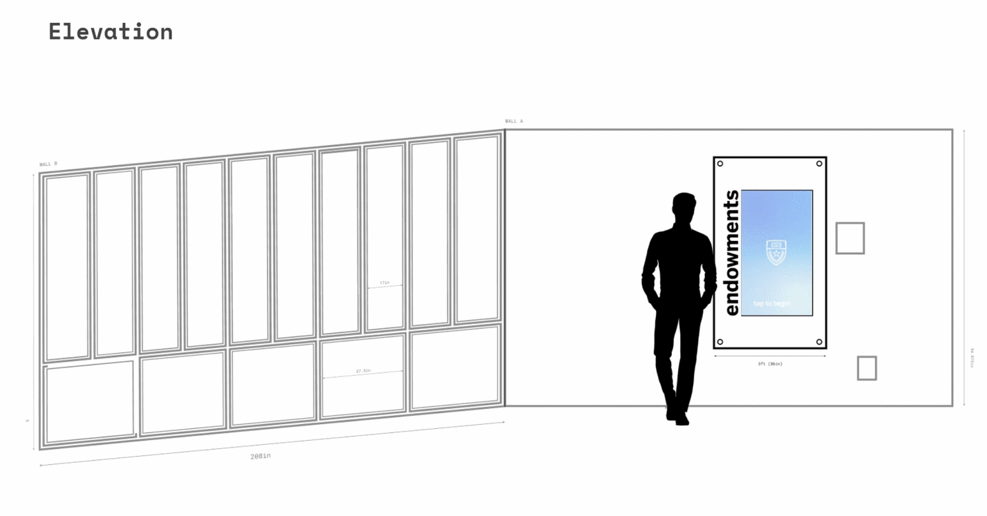
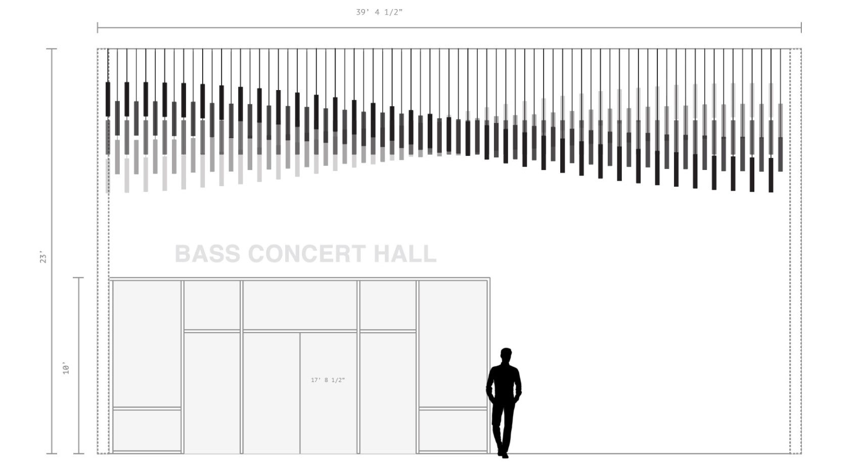
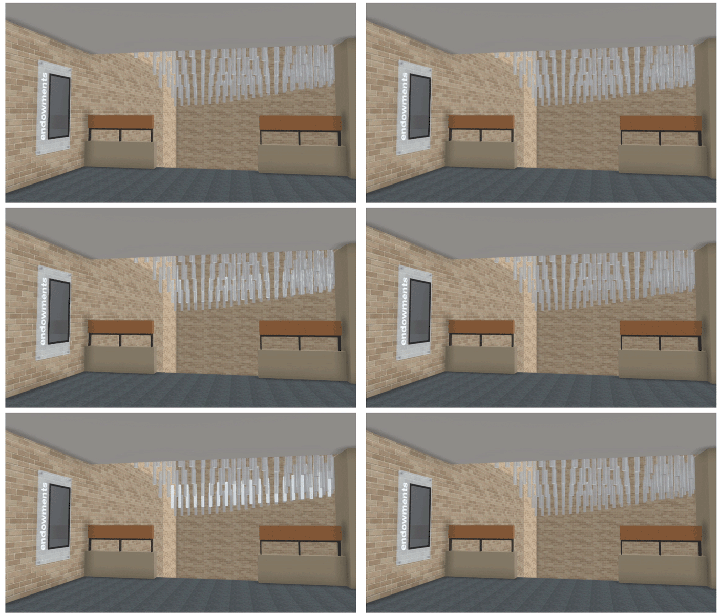
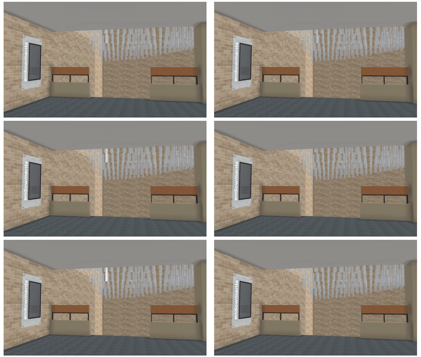
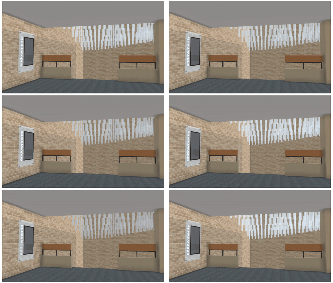
As part of a project-based course focused on Placemaking and Branded Spaces financially supported by UT's School of Design and Creative Technologies, my team and I set out to activate the space in the Doty Fine Arts Building atrium area and reconsider the presentation of the plaques mounted in that space, whose purpose is to honor those who have donated to the College of Fine Arts.
My team's finished proposal for the donor plaques was a light based interactive installation that was intended to both make the space more beautiful by replacing the antiquated donor plaques with something that lives up to both the aesthetic sensibilities and technologically forward nature that stakeholders would expect from a building heavily used by the school's Fine Arts and Design programs.
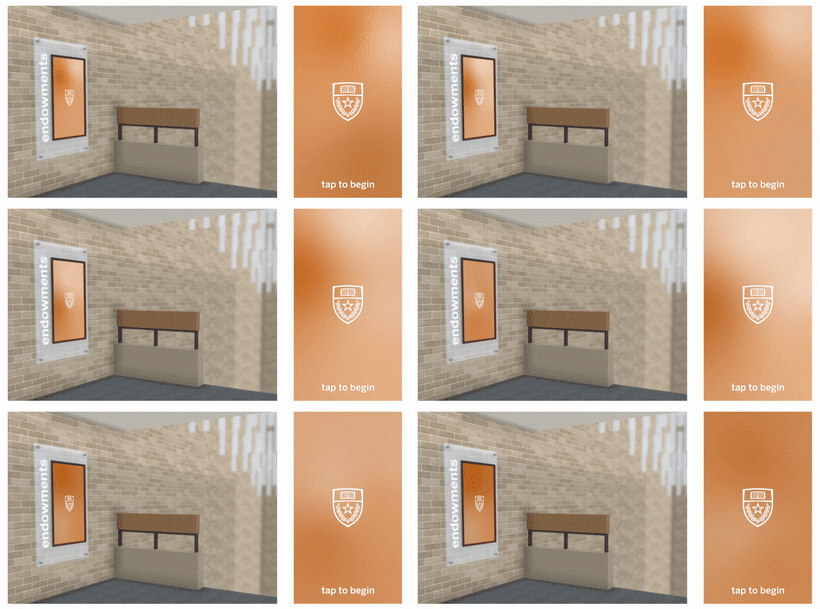
The installation proposal consists of acrylic rods suspended from the atrium representing each donor or other person or program being honored and drawing attention to the atrium by vertically activating the space, which would reflect natural light during the day and be illuminated by different achromatic or colored lights at night depending on context. Our interactive kiosk alleviates any worry donors may have about the change in presentation of their plaques affecting recognition of their contributions by passerby by allowing various types of information such as donor, endowment, or scholarship names and the academic departments wherein they reside to be viewed on the kiosk screen while simultaneously being able to see the corresponding acrylic rods light up. The kiosk would also provide things like the names of scholarship recipients and the thank you letters written to them by the donors.
We also felt it would be interesting to explore how the kiosk and installation could be a source of information beyond its association with the donor plaques, possibly inspired by how UT lights its tower orange in relation to football game wins. We considered examples of color schemes that could be used for when the project its idle and serving its main purpose, as well as some derived from various things like school colors for game days, or colors pulled from posters of shows being performed at the Bass Concert Hall. Our team worked together on the visual elements of the installation like layout, while I personally wireframed and created the prototype for the interactive kiosk.
In spite of the struggles our team initially faced attempting to please all stakeholders involved, we felt our proposed solution would help engage students, faculty, and guests with the donors in a way that the previous plaques didn't, create a landmark space within a commonly frequented building within the College of Fine Arts, allow for a better way to access existing information, and serve as a form of communication between the administration or college an visitors to the Doty Fine Arts Building.